Quick Navigation
- 1Examining the Waterfall Chart
- 2Building the Data Table
- 3Filling in the Data Table
- 4Starting to Build the Waterfall Chart
- 5Formatting the Waterfall Chart
- 5.1Changing the Bridge Series to Line Connectors
- 5.2Hide the Spacer Bars
- 5.3Adding Data Labels
- 5.4Finishing the Connector Lines
- 5.5Final Formatting
- 6Waterfall Chart Example File Download
 When you want to see how different parts of a total contribute to the final calculation, a waterfall chart (sometimes called a cascade chart or a bridge chart) can be a very useful visualization tool. Unfortunately, Excel doesn’t have a built-in waterfall chart option. With a bit of creativity, however, it’s possible to build one using a modified stacked bar chart. This tutorial will show you how to build your own waterfall chart, complete with different colors for positive and negative values and connecting lines…
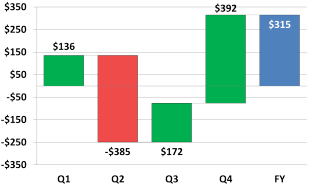
Examining the Waterfall Chart
Normally, we’d start by looking at the data set we are going to use, but a waterfall chart is not a standard chart type in Excel. To understand what we need to do to make one, it’s useful to examine what goes into making a waterfall chart work in Excel.
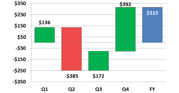
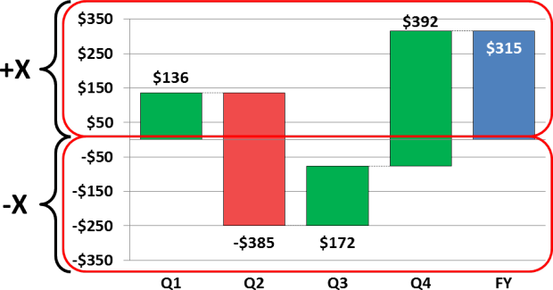
The first thing to note is that the chart is divided into the positive Y-axis and the negative Y-axis, and there are separate bars for each side. This is because the waterfall has to step from piece to piece on its way to making up the total at the end. If we provided positive and negative values in a single data series, Excel would layer them on top of each other along the X axis. We’ll need to break down our data later to match these two sides of the axis.
In addition to the split Y-axis, the waterfall chart is broken up into different elements that make up the data bars, the connecting lines, invisible spacer bars that off-set the parts of the waterfall, and the data labels.
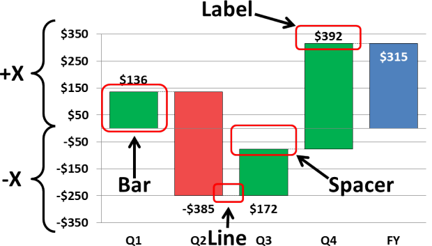
All of these pieces will require separate lines in a data table in order to make up the complete chart. If it seems like a lot of work, don’t worry… This design will automatically do most of the data crunching, leaving us to choose the important things, like colors and formatting.
Thanks for an awesome guide!!!
The formula for B14 and B15 should be changed to the following
=IF(AND(B20=0),-1*ABS(B2),0)
=IF(AND(B20<=0,B2<0),B2,0)
What I did is adding a = after B20. This will allow the chart to work for ending values of 0
Worked like a charm except… I’m on a Mac using Excel 2011 and I found a ton of little horizontal lines all over the place. The culprit, it turns out is using “0” as the value_if_false in the =if functions. The fix, discovered from the interwebs, is to replace 0 with na(). For example,
=IF(AND(C20>0,C2>=0),C2,na())
Thanks for bringing up the issue and offering your solution! I’m sure our fellow Mac users will appreciate it!
So, I wonder how we might have the data labels show each period’s ending cash position rather than the change in cash. For example, period 1 has an increase in 10. Period 2 has a decrease of 2. In what I’m trying to do, the data label for Period 2 would be 8 rather than -2. Any thoughts on how this might work?
Hi snaggletooth,
I don’t have a direct solution, but you might be able to adapt some suggestions from my article on adding percentages to bar charts.
Hi
This was an extremely useful article. I had a question: Is it possible to have 2 water-falls in one chart?
regards
Henna
That really is valuable.
But what about tables having data columns more than 4?
Fantastic guide!. Some customization needed, but this is by far the best waterfall chart out there. Thanks a lot for the effort and making it available.
Hello,
Thank you very much for the wonderful insight… Please advise on how do i add a custom range of values for the data labels – i can do it manually for individual data points using insert text box… however, i did not find any option in charts in excel 2010.
any help will be appreciated…
Hello, Ayaz.
You can add a custom range in a standard way: Right Click on the chart/Select Data…/Add, then select Series Name and range of Series Values. After that, click Ok two times. You will get one more range in the chart.
Then you should Right Click on the range/Change Series Chart Type… and select Line type for the range (only for the range, not for the chart). Next add labels and make the line transparent. That’s all.
But using a template (this or any other) you forced to do many operations with it manually. If you want to avoid such manual operations at all, you can use Waterfall Chart Studio to fast and easy creating the waterfall charts. More details you can find out following the link http://fincontrollex.com/?page=products&id=1&lang=en
You can get charts like this
Thanks for the template 🙂
Cheers
Hi, I like the approach you took with this chart, however I can’t download the sample file?
Ha sit been moved, if so can you re-direct me to where it is now?
Thank you
Hi Shawn! The Excel embed has changed its icons since this article was written. You can download the example by clicking on the download button in the bottom right of the embed. It now looks like an arrow coming out of a piece of paper. I’ve updated the article to reflect this change in appearance.
i want to know if you can have 2 waterfalls in one chart
Thank you
Hi,
Is it possible to setup multiple bars for each quarter with different bar colours by quarter? Example: Q1 has 4 bars – each representing 4 different clients. The same for Q2 etc. But bars are colour coded by their quarters i.e. All (client) bars in Q1 are in red, Q2 in blue etc.
Would be grateful if someone can help?
Million thanks!