Quick Navigation
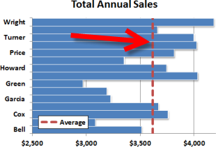 Excel’s built-in chart types are great for quickly visualizing your data. The horizontal bar chart is a great example of an easy to use graph type. Sometimes, though, it can be useful to call attention to a particular value or performance level, like an average or a min/max threshhold. In that case, you’ll want to add a vertical line across the horizontal bars at a specific value. This quick tutorial will walk through a quick way to add a vertical line to the horizontal bar chart type in Excel. As an example, we’ll use annual sales performance with an average value line.
Building a Basic Horizontal Bar Chart
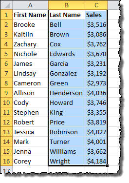
First off, let’s examine the data set. We have a clean list of sales data for a set of employees…

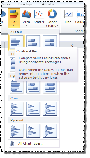
Let’s build a horizontal bar chart for the data. Select the Last Name and Sales columns.
On the Insert menu tab under Charts, choose the Bar icon and select the Clustered Bar chart type.
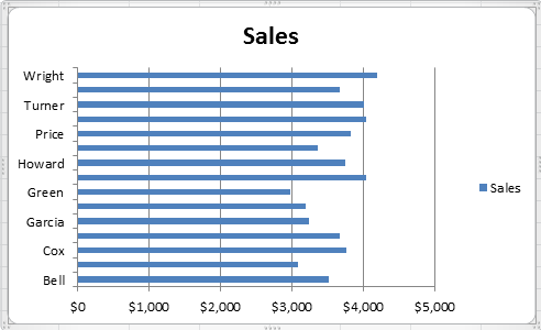
Without any more effort, here is what Excel produces for our data:
excellent walkthrough – thanks very much
Excellent! This solved the issue I’ve been working on the entire morning!
Agreed – this is excellent! Thank you – solved the problem I thought I was completely stuck with.
At last. Got the line on my chart. Took a few goes but got there eventually.
Thanks for the explanation. I recorded the steps mentioned above in a macro and used the same in the VBA code.
Great guide, thanks so much. I had almost given up on being able to make the report in Excel the way I’d been asked to!
Just superb, thank you. And thank goodness somebody like you exists to help us all.
Awesome !!! Thanks a ton. This helped me a lot..
Is it just me?
After creating a chart, where is it shown how to add a vertical threshold line?
Thanks,
Hi Bilo!
The article is broken up into steps to make it easier to follow (it’s very long otherwise!). Please click on the link to page 2 at the bottom or go to step 2 in the Quick Navigation box at the top to get to the next step in the process!
Bilo:
No, it’s not just you. At the top of the page in the “Quick Navigation Box” there are links to several pages. The first, “1. Building a Basic Horizontal Bar Chart” shows how to create a chart. In order to add a horizontal line, you need to go through all of the links, from 1 to 5.
Thank you. This is very clearly laid out.
Great walk-through. Very helpful.
Here is another link I found related to Vertical Line Charts
You can check this out for additional information ! 🙂
http://www.goodly.co.in/vertical-line-chart-in-excel/
thank you very much, help me solved my headache
This is really.. Been pulling my hairs to combine a horizontal bar and line chart for a long long time.. Thanks for sharing
Very helpful guide – excellent !
Genius, thank you so much!
Very clear steps. Worked like a charm on Office 365
is there a way to add a coloured vertical box instead of a vertical line?
hi, currently, i’m using your method to have 2 lines to have a “selected area”. do you know if its possible to do a box instead of 2 lines? thank you
Wow, remarkable, haven’t thought that this is possible in excel! Thank you!
Great post. Not at all obvious or easy, but however you worked it out, well done, and thank you for sharing.
This post rocks! Always wanted to do this, would’ve never thought of the scatter plot overlay