Quick Navigation
 By the end of Part 3 of this series, we have a very functional car loan calculator that gives us a detailed view of the trade-offs between interest rates and loan terms. With all this data at our fingertips, the purpose of a tool can get lost. This is where data visualization can save the day. A clear chart or graph can turn a complicated mountain of information into a simple, intuitive business decision. In Part 4, we’ll change our car loan calculator from an analyst’s tool into a user-friendly application by adding a dynamic chart and heat map using conditional formatting and a little bit of VBA.
What is a Heat Map?
A heat map is just a table of information with two axes. It shows results from a scenario under a variety of conditions, just like a data table. In fact, the data table we created in Part 3 of this series is just missing one thing that keeps it from being a heat map: color.
But not just any color… Painting your table orange or red might make it more eye-catching, but it won’t make the content more interesting. A heat map colors a table according to the content inside it. It might compare prices, shading low prices green and high prices red. It could compare distances, making nearby locations bright and far-away places dim. Most importantly, it compares all the values in the table according to the same set of rules. That way, instead of having to compare numbers cell-by-cell, the user can just look in the general direction of the positive result.
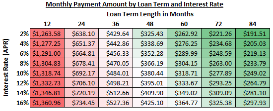
This is a heat map. In fact, it should look familiar, because it’s the heat map version of the data table from Part 4. In the next section, we’re going to learn how to create it from the table we built in Part 3.
Building a Heat Map with Conditional Formatting
I promise, this will be astonishingly easy (with Excel 2007 or newer). Open your spreadsheet from the last lesson (or you can download the example sheet from Part 3), and make sure you are on the first worksheet, called “Car Loan Calculator”.
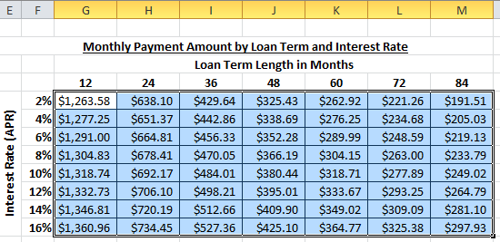
Select the data table that compares interest rates to loan terms.
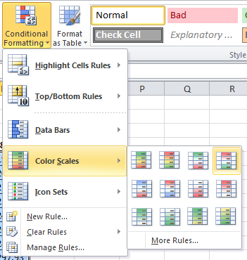
From the Home tab, click the Conditional Formatting menu, choose Color Scales, and select the top-right Red/Green option.
That’s it! A nicely formatted heat map. It is very easy to see the more expensive payments. More importantly, it’s also easier to tell where the breaking point is between moderately expensive payments (in white) and the cheaper ones (in green). The trade-off between loan term and interest rate starts at 48 months (at 2% APR) at the top, and cuts diagonally to 72 months (at 16% APR) at the bottom.

Charting the Payment Schedule
The heat map makes it much easier to read the existing data table. But what about the enormous Payment Schedule worksheet we built? It wasn’t very readable in it’s table form… Let’s build a chart to visualize the payments over time…
Click on the “Payment Schedule” worksheet tab, and select columns B:E.
Choose the Insert menu tab, select Scatter from the Charts menu, and click on the Scatter with Smooth Lines option.
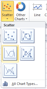
Our initial result does not look promising:
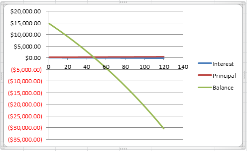
Don’t worry, though. We’ll make it better. First, let’s get the chart onto the same page as the rest of the calculator.
Select the chart and Press CTRL+X (cut command).
Click on the “Car Loan Calculator” worksheet tab.
Press CTRL+V (paste command).
Setting the X-Axis and Y-Axis
The reason the chart looks so terrible is that it is charting all 120 payment periods in the table, even if the number of periods in the loan is much less. First, let’s see if we can fix the axis to only show the periods we care about.
Double-click on the x-axis (the horizontal axis) on the chart to bring up the Format Axis dialog box.
Under Axis Options, change Minimum from Auto to Fixed. Set the number to 0 (zero). Change Maximum from Auto to Fixed. Set the number to the current number of periods in the loan term (48 in my example).
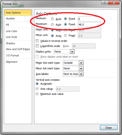
Then click close.
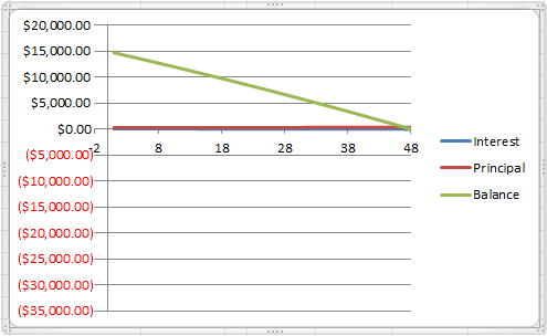
The chart looks a bit better, but we still need to fix the Y-Axis. Double-click on the y-axis (the vertical axis) on the chart to bring up the Format Axis dialog box.
Under Axis Options, change Minimum from Auto to Fixed. Set the number to 0 (zero). Change Maximum from Auto to Fixed. Set the number to the starting loan amount (15000 in my example).
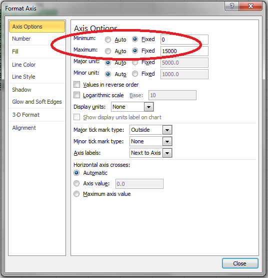
Then click close.
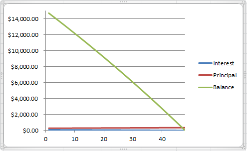
We’re getting closer to what we want, but it’s still pretty hard to read the lines for Interest and Principal. Let’s give them their own scale. Double-click on the line representing Principal on the chart to bring up the Format Data Series dialog box. Under Series Options change Plot Series On to Secondary Axis and click close.
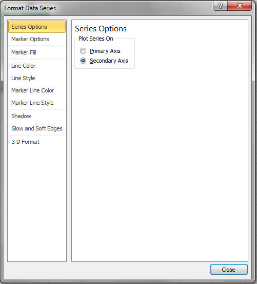
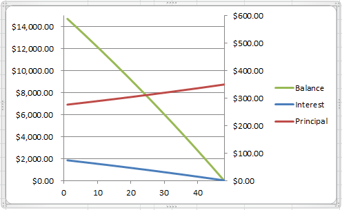
Repeat the process with the line representing Interest on the chart. You may need to Set the new Y-Axis Minimum to Fixed and choose 0 (zero).
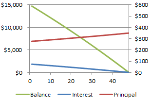
Finally, we have a chart that clearly represents the higher cost of interest in the beginning of the payments and the increasing contribution to the principal of the loan balance! Snazzy!
You thought we were done, didn’t you…
These visualizations look great, and they make it easy to understand what all this data is telling us about the terms of the loan, but something is not right. Try changing the loan term, or changing the loan amount, or changing anything about the inputs to the loan equation. Suddenly, our fancy chart isn’t looking so great. Fortunately, the heat map and data table update nicely, but we’re going to have to make Excel stretch a bit to keep the chart looking proper.
What is VBA?
To get the automatic update to the chart axes that we need, we’re going to use a very advanced technique. Excel has its own programming language called Visual Basic for Applications (VBA) that lets you control everything about the program. I don’t mean just formulas and functions. I mean everything – menu options, object settings, columns, rows, cells, and formatting are all fair game. Literally anything you can do with your cursor and keyboard in Excel can be controlled with VBA.
However, with great power comes great complexity. VBA is hard. Therefore, for this example, we’re not going to try to understand the details. Read over this section. If it seems intimidating, you can skip it. The calculator works great without it – you’ll just need to manually update the axes on the chart if you change the values.
NOTE: Before we do any work, we need to make sure that our file is saved in a Macro-enabled format. Click File and choose Save As… In the dialog box, change the Save As Type to Excel Macro-Enabled Workbook. Click Save.

Updating the Chart Axes with VBA
First, we need to know what Excel calls our chart. Select the chart and look to the left of the formula box for a label. In my example, the chart is called “Chart 1”.
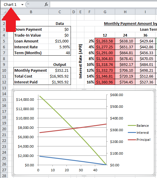
Now, we are going to go somewhere new. Press ALT-F11. This will open a new window called Microsoft Visual Basic for Applications.
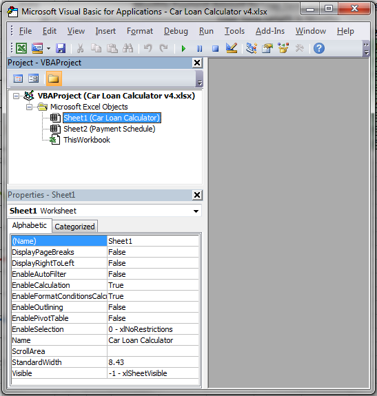
In the Project – VBAProject dialog, under VBAProject (Car Loan Calculator v4.xlsx) (your filename may be different) and Microsoft Excel Objects, double-click Sheet1 (Car Loan Calculator).
This will open a sub-window with two drop-down menus. In the left menu, select Worksheet. In the right menu, select Calculate.

Underneath the Private Sub Worksheet_Calculate() line, paste the following lines of code:
With ActiveSheet.Shapes("Chart 1").Chart.Axes(xlCategory)
.MaximumScale = Range("C7").Value
End With
With ActiveSheet.Shapes("Chart 1").Chart.Axes(xlValue)
.MaximumScale = Range("C5").Value
End With
If the name of your chart was not “Chart 1”, change the two references to “Chart 1” to “Your_Chart_Name_Here“.
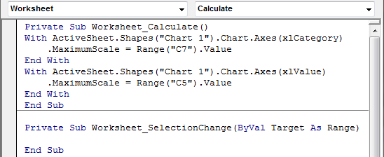
Press CTRL+S or click the Save icon and close the Microsoft Visual Basic for Applications window.
Experiment with the VBA Results
This is important! Whenever you write VBA into your spreadsheets, the results can be unpredictable. So, test your code!
With luck, your chart should happily change its X and Y axes as you change your Loan Amount and loan Term amount!
Car Loan Calculator Heat Map and Chart Example
NOTE: The Excel Web App cannot run the macro we created inside the app. If you download the file and enable the macro on your home computer, it will run the VBA code and update the chart automatically. You can download the sample file by clicking the Excel icon in the bottom right.