Quick Navigation
 Here’s the drill… You’ve got a set of data dumped from some performance analytics database… It has a basic date series with some kind of output, and you need to put it into a chart that your executives can understand at a glance. Excel has an extremely powerful charting system, but it is not at all obvious or easy to use, particularly when you have a non-standard set of data. Odds are, your data is not set up the way Excel wants it to be, so you’ll have to do some leg work. Let’s walk through an example of data transformation and Excel charting…
Examine Your Data
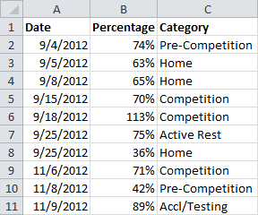
This is a common refrain in my tutorials… Every data set is a little bit different, and choosing how you w ant to present it is 50% of the battle. Let’s look at what we’re starting with today:

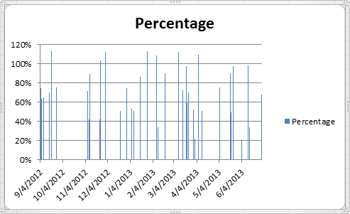
And this is the standard chart that Excel creates:

Not so great. We’ve got some work to do…
Hello!
In the every first picture there are only September and November dates in Column A, but then in the 5th picture the Dates in Column A have changed to include December, January, and February. I don’t understand how the dates got changed after reading the instructions a couple of times – feel free to email me.
Thanks for this Webpage on Multi-series charts. You helped to display the data much more efficiently and that’s Important when presenting data.
Joe Miyaki
jmiyaki@sehinc.com
Hi Joe,
The data was sorted to put all the data points from the same category next to each other. This makes it easier to build out columns for each category.
Andrew, thanks a million for this presentation. We have been bashing our brains out trying to figure out how to chart multiple species’ abundance over multiple sites in our intertidal survey of the California coast using newly acquired Excel skills and had not yet learned how to present data to Excel to achieve this result. Your effort on this page is very much appreciated. James.
Hi Andrew, Thank you so much for this. Like James I’ve been trying to figure out how to chart one species, Pearl-bordered fritillary, over 5 sites, over 5 years. Your tutorial helped me a huge amount. Thank you so much. Paula.
Hi,
I just wanted to thank you for this amazing guide! It really saved me time and gave me further insight into the powers of Excel.
-Ted
How would you set the Axis to recognize 3 different formats. My data includes whole numbers, percentages and currency depending on the selection.