Quick Navigation
Removing the Date Gaps
We’re going to tackle the date issue first. The secret to Excel charting is that it always tries to guess what sort of chart you need based on how the data is formatted. Standard date formats get turned into a date series axis in Excel, we we’re going to trick the program into thinking they’re not dates. We’re going to do this by converting the dates to text so Excel can’t tell how to sort them. We’ll keep the original dates available for us to use in sorting, etc.
Insert a new column in between the Date and Percentage. I’m calling mine Date Text. We’re going to use the TEXT() function to convert the numbers to text in Excel, which has the following syntax:
=TEXT(value, format_text)
The value in this case is the date field from column A.
The format_text is the format of the number before it is converted to text. In our case, we’re going to use an abbreviated Month Day format.
In column B, insert the following formula in cell B2:
=TEXT(A2,"mmm. dd")
We are taking the date in the A column and using standard Excel date formatting to specify that we want 9/4/2012 to become “Sept. 4”. You can drag the formula down to cover all the rest of the date rows.
Excel will read these “dates” as text and put them in a nice row in the chart:
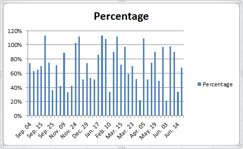
Things are looking up already…
Hello!
In the every first picture there are only September and November dates in Column A, but then in the 5th picture the Dates in Column A have changed to include December, January, and February. I don’t understand how the dates got changed after reading the instructions a couple of times – feel free to email me.
Thanks for this Webpage on Multi-series charts. You helped to display the data much more efficiently and that’s Important when presenting data.
Joe Miyaki
jmiyaki@sehinc.com
Hi Joe,
The data was sorted to put all the data points from the same category next to each other. This makes it easier to build out columns for each category.
Andrew, thanks a million for this presentation. We have been bashing our brains out trying to figure out how to chart multiple species’ abundance over multiple sites in our intertidal survey of the California coast using newly acquired Excel skills and had not yet learned how to present data to Excel to achieve this result. Your effort on this page is very much appreciated. James.
Hi Andrew, Thank you so much for this. Like James I’ve been trying to figure out how to chart one species, Pearl-bordered fritillary, over 5 sites, over 5 years. Your tutorial helped me a huge amount. Thank you so much. Paula.
Hi,
I just wanted to thank you for this amazing guide! It really saved me time and gave me further insight into the powers of Excel.
-Ted
How would you set the Axis to recognize 3 different formats. My data includes whole numbers, percentages and currency depending on the selection.